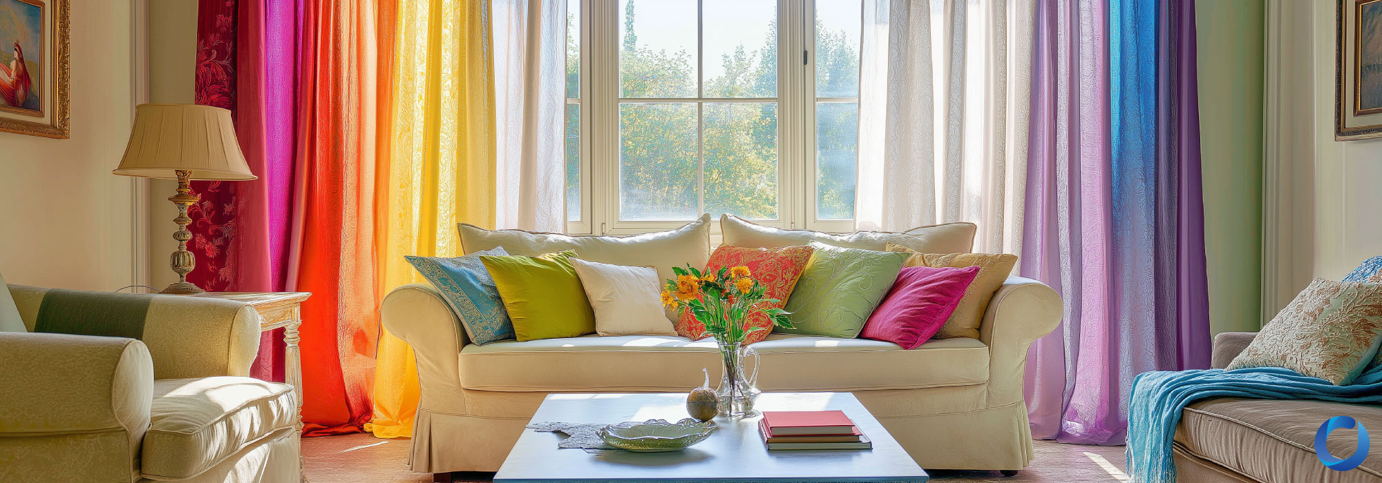
The Psychology of Colour in Curtain Design
August 2, 2024
by Sheryll Low
History of Coloured Curtains
When the Great Egyptians furnished the first curtains in human civilization, their achievement has since been a significant one. While physics appropriately defines the perception of colours feasible through specific wavelengths which originates from electromagnetic radiation, this definition alone inadequately underlines the impact of colours and fabric, of which is mystified by the cultural success of combining materials to block out or allow sunlight to filter through homes.
From there on, light was a matter of being harnessed for various intentions. We witness the history of curtains in the passing glances at paintings, literature, and architecture. At the height of the Byzantine Empire, the wealthy favoured heavy curtains of purple and red, the latter being common in the background of buildings within preserved artworks, a hallmark of power, nobility, and status. Such vibrancy indicated luxury, privilege, and extravagance for those who could afford drapes. The influence of curtains as unspoken social standing continued consistently in the later eras, undergoing a difference in aesthetics and perception when fabric became a stylised pursuit through Europe, brought on by Italian artists and visionaries in the same celebration of glass windows introduced by their torchbearers, the Romans.
This change in artistic currents was formally referred to as the Renaissance period, where curtains sported multiple variations to green and red. Each iteration of these curtains were layered with increasingly complex ornamentations when quality fabric materials, primarily linen and silk, became more readily accessible for designers, parting creative floodgates with liberal couture and aestheticized contrivance - green curtains in particular reflected the transformation, tamed with embroidery resembling floral imprints on richly shaded cloth better suited in the home of elites. Fast forward, and we see a trend during England’s Regency Era that parallels the blossoming aristocracy of the French in blue, pink, gold, and white; a vogue persisting to the mid 90s in favour of the creamy, pastel palette for both romantics manifold in common households, mirroring the ever-present indulgence observed from historical monarchs; and so the story goes with people’s vacillating preferences.
Acacia’s diverse European origins is our company’s pride, especially in discussion of quality fabric in coexistence with clients’ stylish, comfortable living. In commemoration of this diversity, it is worth noting that the trends identified before differ in the contemporary era of new modernism today, whereby curtains in homes are viewed more as a practical must-have in alignment with society’s industrial values than excessively decorative display. Still, when encountered with the subject of refurbishing or renovations for an abode, there is an intricate, cultural and psychological process that is not exempted from the modern man, with casual introspection such as, “does my living room look good the way it is?” or, “something feels missing from my living space” not being recycled vanity as much as they are sentiments that ensure the value of colour is not simply important, but a timeless choice.
The emphasis of curtains alongside humanity despite its accepted identity as a commonplace furniture is a combination of something that is cultural and psychological. With its history previously outlined, its cultural impact is certainly visible and easily dissected, but art is congruent with culture, and the backbone of art itself is psychological. The question, “why curtains?” being the topic of symposium out of every other, fabric-made fitment is a correct one: curtains, like tables or chairs, ceilings and walls, beds and mirrors, are a feat of human craftsmanship that could all be innovated with one key difference: its presence in a home is, while at purchase imperative, its influence on inhabitants is almost subliminal.
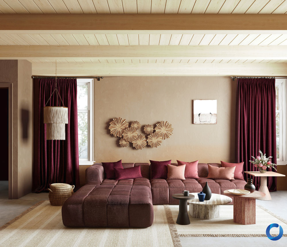
Confidante / Collection
The Psychology of Art with Purpose
Think of your room as a painting, and that every furniture and item stored in it as still-life objects you would normally observe in them. Among the muted blend of tables, sofas, and bookshelves, curtains are liminal, but pepper much-needed colour in the background close to a natural source of light. In a modern home, they can thus be changed subtly along with your living spaces without the fear of sacrificing the overall composition. This has a lot to do with colour theory. The basis of colour theory acts as a guideline for designers to comprehend and experiment with intent. It is essentially a versatile fundamental to achieving ideas such as colour harmony, colour palettes, colour schemes, and contrast, and having a technical grasp on the theory subsequently lends a more skilful outlook at how colours can be appropriately applied onto one’s works.
Without too much jargon, of course, colours are often categorised into either warm or cool colours, both of which separately have a different effect on individuals. Knowledge of these components will help better envision not just how colours work on curtains, but why they do. Red, orange, and yellow are typically considered warm colours, which are vibrant hues that can enhance the cosiness of your home, while cool colours such as blue, purple, and indigo hold a lower value in colour, which helps to set a subtle, calm mood in comparison. Once you are able to relate these colours on curtain fabric and how light reacts to them differently, you would then be excellent at setting the ideal atmosphere for your living environment, perhaps even receiving the benefits of the well-desired therapeutic effects a change in colour might provide.
Before that, keep in mind as well that how you feel about certain colours should be the marker of what curtains are most appropriate for you, as colours are meant to be highly personal and emotional for each person at the end of the day. Despite studies underlining a consensus on the functional impact by colour emotions, findings are commonly generalised, and may not always be accurate to your own feelings regarding them. We will also include an extended section below that delves into how you can experiment with the patterns on an existing base colour of your curtains, and how adjusting colours can aid in mitigating certain unwarranted side effects listed from them.
Without further ado, for homeowners who want a more elaborate colour guide to their curtain furnishing experience:
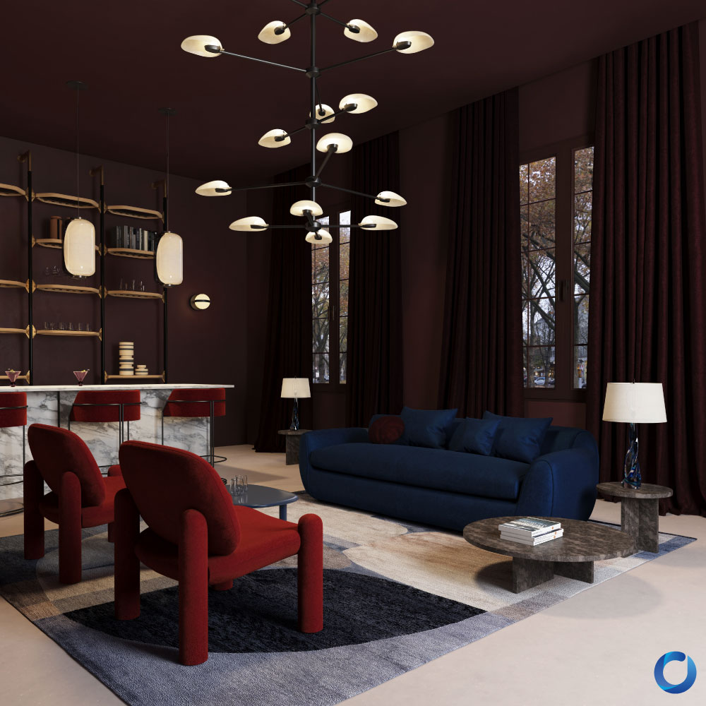
Sensuous / Collection
Red
The hue that heralds supreme in theatres and auditoriums. Studies have traced associations of this warm colour with intensity, passion, power, and love. You would see this hue in roses, festive seasons, and on warning borders. In its unaltered state, it is a highly mentally stimulating colour that captures attention quickly, which could invoke strong, immediate feelings with its vibrancy and unsettle owners with its dramatic shades that horror movies have conditioned closely to violence and fury. It may also induce headaches in a handful of individuals with increased sensitivity after prolonged exposure to such a colour in their homes. However, do not let its potential frighten you too much as it has remained unmatched in popularity for curtaining special rooms meant for gallery viewing or movie nights, and perfect for those who wish to establish an air appreciating theatrics in artistic tradition in their homes. It is an embrace that shares a hue with your own body circulation, an intimately exciting reminder that would welcome your daily return.
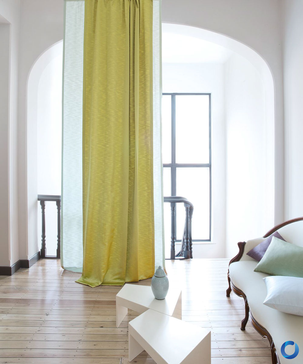
Raider / Collection
Yellow
Frequently idealised with happiness, high energy, and cheerfulness, curtains of this hue are more appropriately found in children’s rooms. Its presence serves as an encouragement, and having yellow curtains in your home amplifies personal motivation when the sun is at its peak in the day and coats your world with a shade of unrivalled gold and warmth. Many interesting things are associated with this colour: bananas, the sun, sunflowers, and bees. Much like red, it is eye-catching, and is observed ominously on select warning signs, but does not seem to arouse the same, strongly negative sentiment of the former. Research highlights that it can not only elevate the spirit of others, but also increase your overall appetite. While it is a colour that is slightly rare on curtains in these times, it would likely help ignite a promising flame for your days ahead.
Vital / Collection
Green
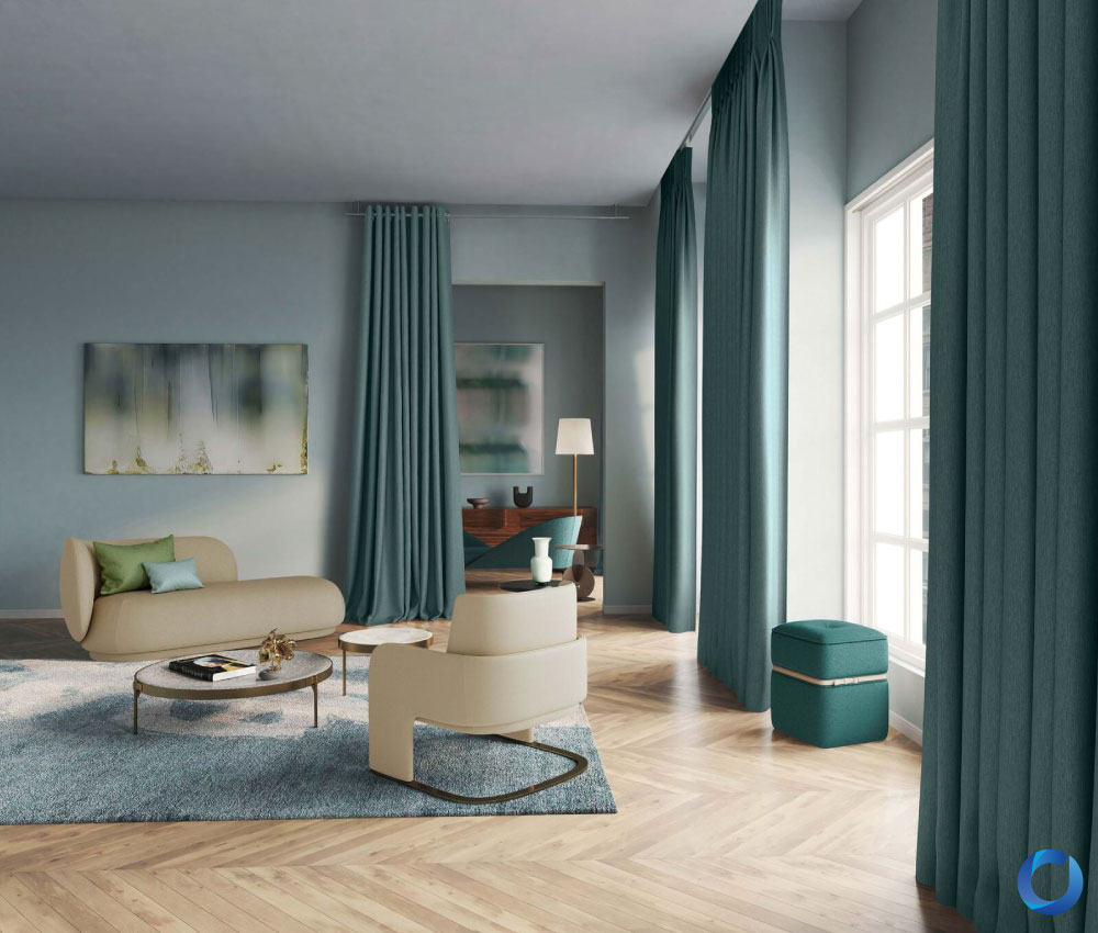
A middle-ground sort of colour. If you ever observed green curtains in renaissance paintings, you would see that they can be somewhat neutral and consistently consolidated with the rest of the items in the work. It is believed that green is the colour of harmony, an ancestral joint rooted in the nature that surrounds us, and having green curtains allows a piece of this earthly world to exist within its reclusive counterpart. Green brings a calm reminiscent of pastures, verdant fields, and rolling hills that balances the overwhelming pressure of our workplace identities with a floral shade that can be calming for many in a way house plants similarly fulfil.
Traverse / Collection
Blue
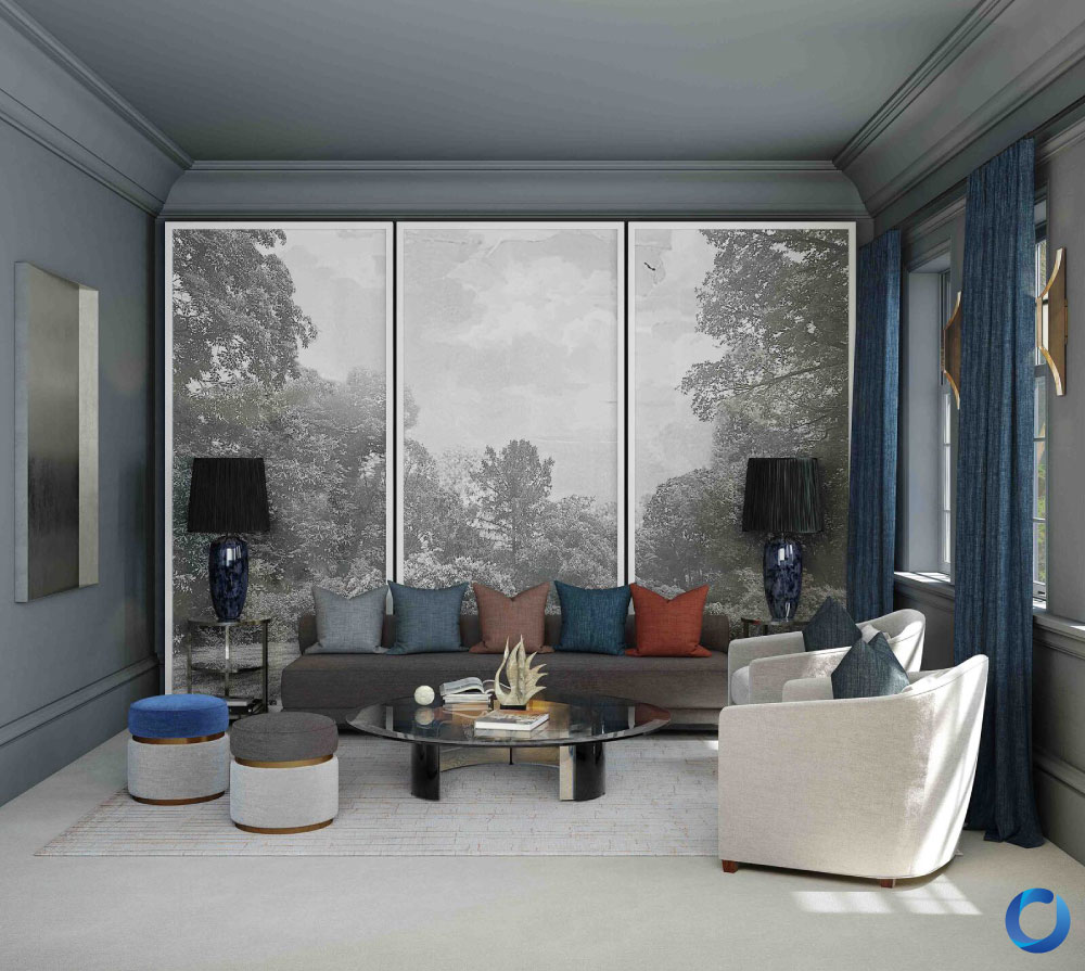
A colour of delicate origins. In Vincent van Gogh’s famous painting, The Starry Night, blue is one of the most prominent colours layered onto his impressionist work, the work having embodied the melancholia of the artist who viewed the countryside through his asylum room. Before it became grouped with notions of regality (“royal blue”), art and literature have always been deeply engrossed in the involvement of blue curtains in fictional settings to allude to the struggles of mental health. Beyond that, blue is the colour of the sky, the ocean, and the water that moves and gives us life, even regarded as a soulful colour in certain cultures. Through modulated lightness, blue curtains bring both the endless depths and serenity of the sea right into your home. Effective for reducing stress with its available cool, soothing tones.
Confidante / Collection
Purple
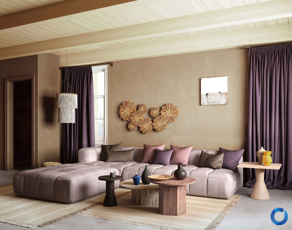
The colour of nobility, extravagance, and indulgence then and even now. Purple is the perfect colour if you are looking for the essence of comfort and luxury. Some airline companies drape the corridors with purple curtains for such a reason, and it is a colour that has a weight to it, not confined to its fabric material, which inspires strength and personal ambition.
Cavalry / Collection
Black
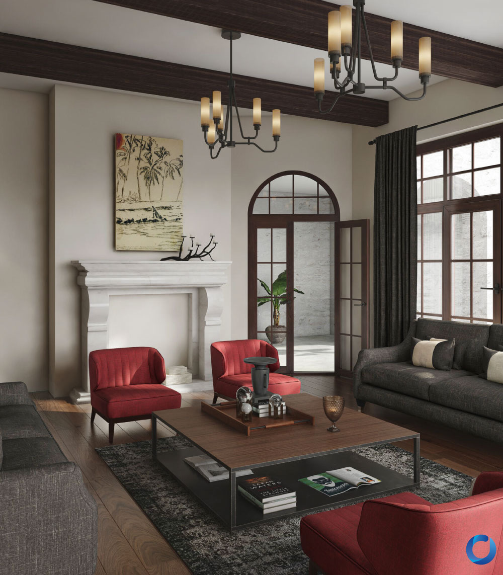
An uncommon curtain colour associated more with the new industrial aesthetic, black is the extreme colour for setting a stern, minimalist mood that can greatly help individuals get into the proper mindset, improving concentration, productivity and self-discipline when you remove flashy, visual distractions from your home life. A sophisticated sign of one’s iron will.
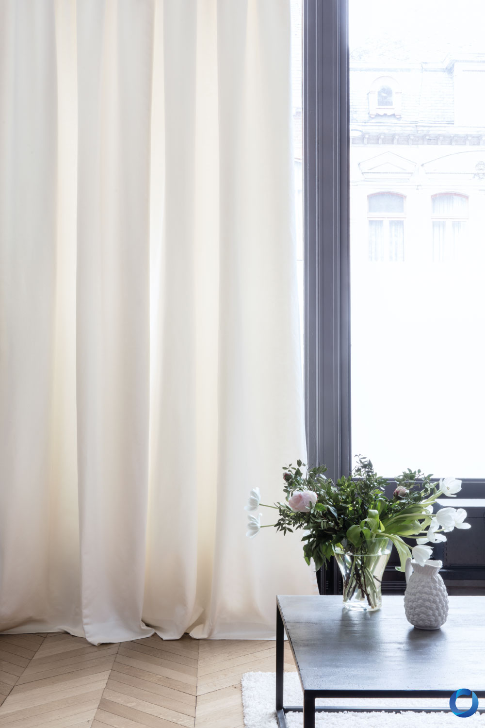
Quantum / Collection
White
Known as the absence of colour, white is the pinnacle of elegance, purity, and minimalism, standing out in a room filled with already colourful furniture and walls. It has a decluttering effect on individuals, helping to increase a sense of tidiness, order, which supplements mental clarity and refreshing tranquillity.
With this, one way of experimenting with curtains and their effects is to play around with the colours’ saturation and what other hues complement them. An example of the former is to install desaturated colours to reduce the risks of side effects with colours such as red, resulting in a less aggressive and more pleasing shade. The converse of this would be to combine complementary colours - complementary colours are colours that are the opposite of each other, like red and green, and when placed together, are able to elevate their unique vibrancy separately.
You are invited to take a glance at Acacia’s broad catalogue of coloured curtains, such as our ‘Life’ collection, which features airy, translucent and light-weight curtains appropriate for minimal spaces, or ‘Raider’, an alternatively grounded inventory that demonstrates the comfort of darker curtains in modern displays.
Summary
Colours in curtain designs have always been shaped by historical origins and maintained for their cultural and psychological impact, all with their unique way of affecting the perceiver. While designers study and tailor curtains for the masses, what effect it has ultimately rests on your own preferences.
Looking for quality sofas with creative fabrics and easy maintenance? Find the nearest showroom at acaciasofa.co
If you are searching for the perfect curtain to express your personality at home, find our nearest boutiques at acaciacurtain.co